
❤️🩹 Credit Karma Money Heartbreaker Experience
I re-designed a save interjection experience for when a customer switches their method of refund deposit from a Credit Karma Money option.
📅 Sep 2023
🧠 Product Design / User Research / Prototyping
🛠️ Figma
🏡 Background
Ever since Intuit acquired Credit Karma, TurboTax customers have had the option to deposit their refund into a Credit Karma Money account. Customers have the ability to receive their refund five days in advance if they deposited their refund into a Credit Karma Money account.
A “Heartbreaker” is defined as a TurboTax customer who selects Credit Karma Money as their method of depositing their refund, but later decides to change their refund deposit method. In 2023, we saw around 131K customers would open a Credit Karma Money account, but would switch their refund option to a non-Credit Karma Money option.
The existing heartbreaker experience for these customers retained 11-27% of customers. For 2024, we saw a need to redesign this experience to improve results.
🤔 User Problem
Customers open a Credit Karma Money account but they change their mind, switching to direct deposit or paper check to receive their refund. They don’t think getting their refund five days early is fast enough and are not confident in Credit Karma as a bank.
💡 Hypothesis
If we surface Credit Karma Money account benefits in comparison to a traditional bank, then customers will feel increased trust in Credit Karma and deposit their refund into a Credit Karma Money account.
🔎 Existing Experience Analysis
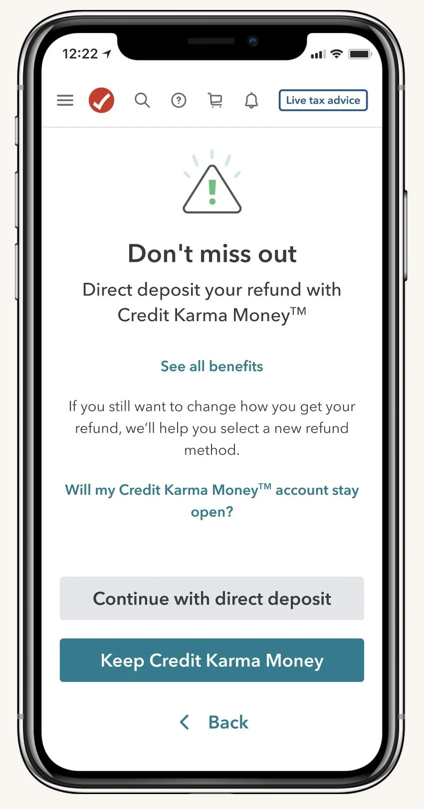
Our existing heartbreaker experience
The existing Heartbreaker design can be seen as a disjointed experience. When a customer goes back to the refund selection screen to review or change their refund deposit method, the heartbreaker experience is triggered as a new screen. On top of that, the design and copy do not highlight the benefits of a Credit Karma Money account. This design can be seen as yet another screen in an already long process of filing taxes. I questioned how might we be able to highlight the benefits of a Credit Karma Money account without adding to screen fatigue for customers?
🤓 User Research
The Accelerate Credit Karma team organized rapid customer interview calls in March 2023 to seek clarity on why customers who completed the Credit Karma Money sign-up flow later decided to change their refund deposit method. These interviews served to provide insights on how to improve the heartbreaker experience to improve recovery rate in the following tax year.
📊 Quick Stats
➡️ 70% of respondents had initial Refund Advance intent. Refund Advance is an offering where eligible users can receive a portion of their refund almost instantly in a Credit Karma Money checking account after IRS acceptance with $0 loan fees, 0% APR, and no impact on credit score.
➡️ 30% of respondents were “true heartbreakers” who simply changed their mind.
➡️ 84% of respondents were motivated by need for fast cash.
🔑 Key Themes
Customers with Refund Advance intent fell into 1 of 3 circumstances:
Thought 5 Days Early was Refund Advance, so went back to the refund selection screen to confirm.
Experienced issues with Credit Karma login, so later changed their refund method out of frustration.
Were disqualified from Refund Advance, so selected Credit Karma Money as an alternative but later changed their mind.
True Heartbreaker customers made similar statements about their reasons for change:
All were not confident about Credit Karma Money as a dependable account option. More specifically, there was hesitation surrounding Credit Karma Money’s speed to refund capabilities including uncertainty on when or where a debit card would be received and how quickly funds could be transferred.
5 Days Early was not fast enough as a replacement for Refund Advance.
Confusion about Credit Karma’s relationship with TurboTax or if Credit Karma Money was a bank account and not a general credit monitoring service.
💭 Considerations for next steps
For an improved in-product design and experience, it was concluded that due to high interest in fast cash speed to benefit, the heartbreaker experience should leverage loss of 5 Days Early as the main motivator as well as secondary value props to help build confidence.
🚧 Constraints
I had to keep in mind the constraints and technical feasibilities of creating this experience. A constraint was that I needed to utilize or contribute to existing capabilities owned by other teams. I had to create within our design system and components in mind.
🧠 Qualitative and quantitative research
Before jumping into designs, I conducted some outside-in research of other products. Additionally, I worked closely with our UX researcher to synthesize customer learnings regarding Credit Karma and Credit Karma Money.

🧪 Concept testing
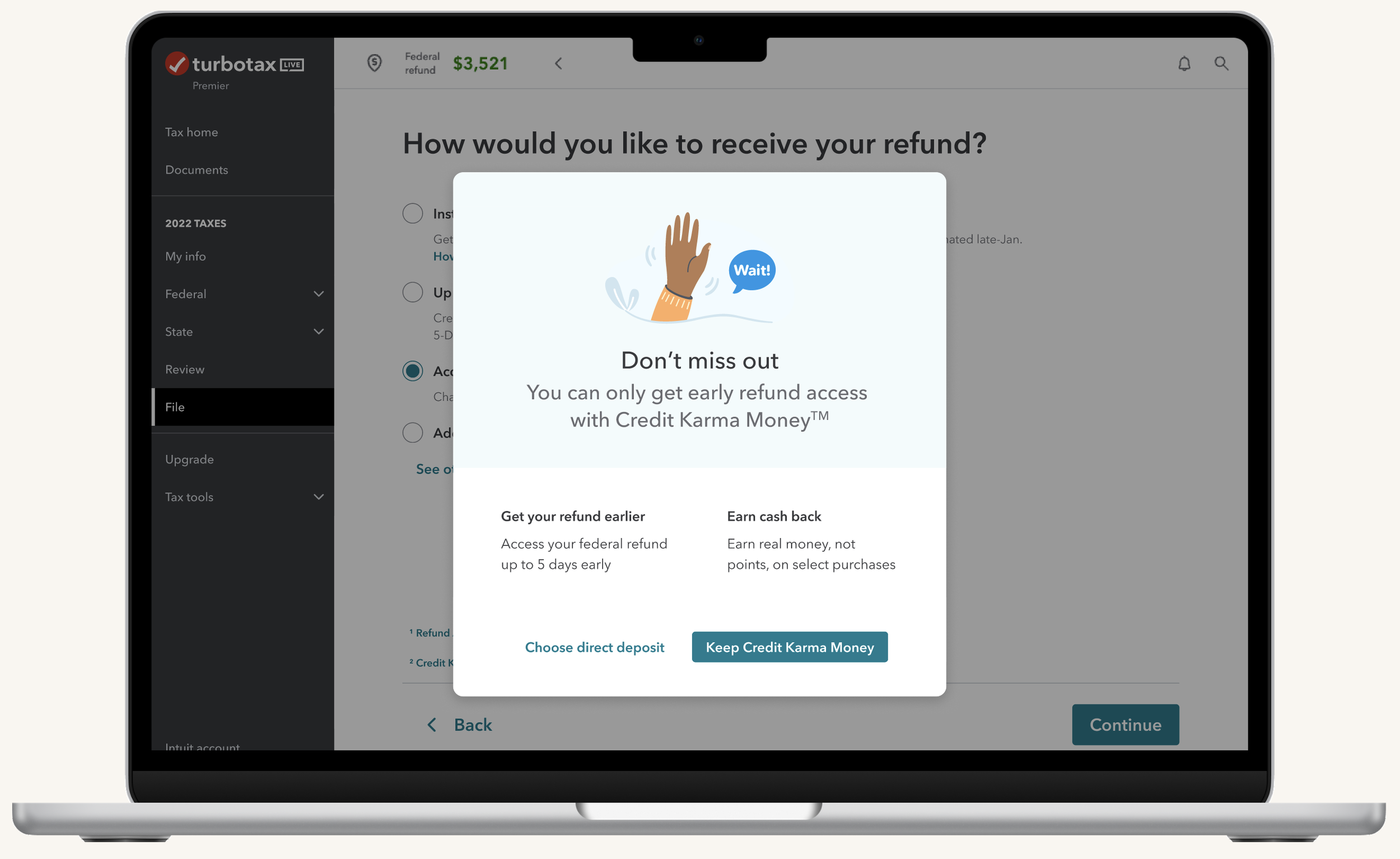
I came up with two interjection opportunities. The first was utilizing a banner on the refund selection screen that highlights the speed to refund of a Credit Karma Money refund option. Some pros of this design were 1) We are able to pre-select their refund method and highlight the banner as well as 2) no additional screens are added. Some cons include 1) not enough information about Credit Karma Money. The second interjection opportunity was a similar design to the existing Heartbreaker screen. After a customer selects a different refund method, either a full screen with a list of benefits would appear, or a modal with a list of benefits would be triggered. Some pros include 1) listing out additional benefits and 2) using persuasion tactics - like loss aversion - to convince users. Some cons include 1) adding an additional screen to an already long flow and 2) some benefits may not be convincing to certain users. I presented these opportunities to my team and they preferred the second interjection point - specifically the use of the modal. The modal allowed for a soft reminder, but wouldn’t add to screen fatigue as compared to inserting a full interjection screen.

👥 User testing
After deciding to create a modal design, I had to think about how best to present Credit Karma Money benefits. I narrowed to two main concepts 1) a list of a couple key benefits of having a Credit Karma Money account 2) a comparison chart that shows Credit Karma Money account benefits as opposed to a traditional bank. With these two concepts in mind, I conducted user testing to gain quick feedback from customers. I presented these two concepts in random order to ten customers to gather more feedback and overall sentiment on each design.
Modal design with benefits listed
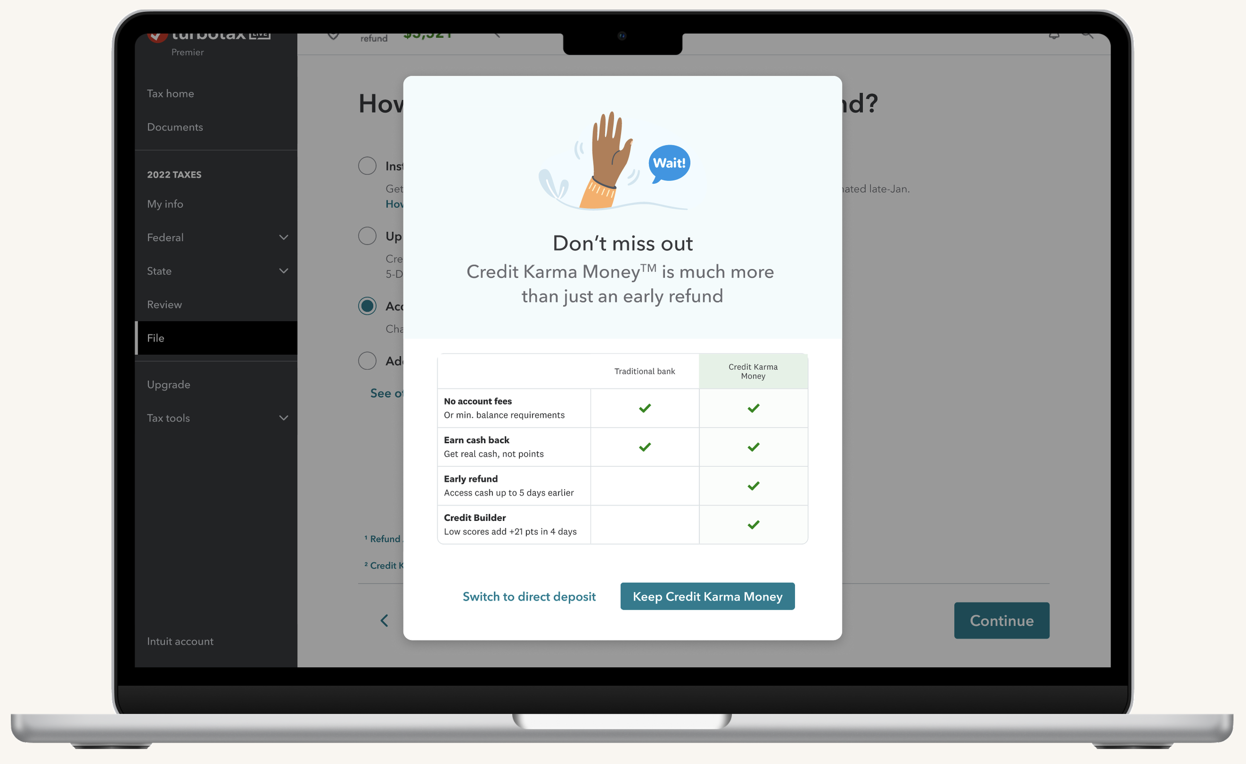
Modal design with comparison chart
There were a few key learnings from user testing. There was an overall consensus that customers liked the comparison chart as opposed to a benefit list. Reasons included that the benefit list offered too little information, and the comparison chart allowed users to see the potential of Credit Karma Money as a bank. A couple users pointed out that the modal was a good design to flag Credit Karma Money offerings because they would easily be able to go back to the refund selection screen to weigh their options.
From user testing, it seemed that the comparison chart modal design would be the most effective way to list benefits as well as address customer concerns on their lack of confidence in Credit Karma Money as a bank.
🎯 Finalizing designs & addressing technical feasibilities
After user testing and reviews with my design team, I changed the design of the modal by eliminating the illustration. It took up too much space and could be distracting from the comparison chart. In addition, I worked closely with content partners, legal, research partners, and stakeholders to layout the key benefits in the comparison chart. Due to the fact that many customers expressed their concerns on Credit Karma Money as a real bank, we thought it would be important to lay out a few table-stake benefits that traditional banks would also offer. After aligning on these benefits, I partnered with our engineering team to see how they could bring this experience to life.
However, I ran into another issue: technical feasibilities with our engineers. The comparison chart design was not an existing component in our system and would be too big of a scope to build out. I worked with the engineers to find a compromise and pushed hard for this comparison chart to be built from modifying an existing component. I presented the research and testing analysis to convince them that this chart would be beneficial to the customer experience. In addition, this comparison chart could be utilized in other parts of the tax filing experience. In the end, the engineers were able to build out this design by modifying an existing component.
🔔 Where we are today
We ran this experience as an A/B test in November of 2023. We saw the new design out-performing baseline with more users sticking to Credit Karma Money as their refund method, with a rate of 1 point higher than control. We have rolled this experience to baseline.
I have contributed a scalable comparison chart component that will be leveraged across all tax experiences.
New baseline heartbreaker experience